I work with speakers to help clarify their messaging, then build everything around it: the identity, keynotes, presentations, signage, templates, down to the smallest details, for senior leaders and technical teams. I often work inside an existing brand system, adapting it to the venue, message, or speaker. But when a project needs something new, I'm very happy to build from scratch!
Here's a recent summit, where a senior executive brought hundreds of her leaders in from around the world for a strategy meeting. With that many people, that much travel and accommodations, and that much riding on it, every detail had to work.
This work was a large cross-functional effort across many teams. I led the visual design and branding. Project names, titles, dates, faces, and details have been changed, blurred or anonymized when necessary.
Events, environments, and objects that help ideas show up in the real world.
A room of engineers, an org-wide celebration, and a customer research all need something different. I try to figure out what that is, then promote the concept through each piece of the design.
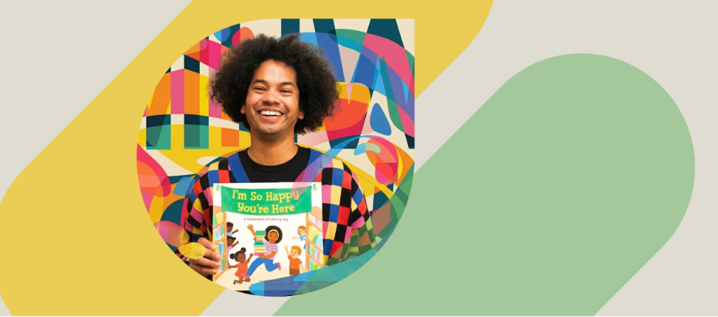
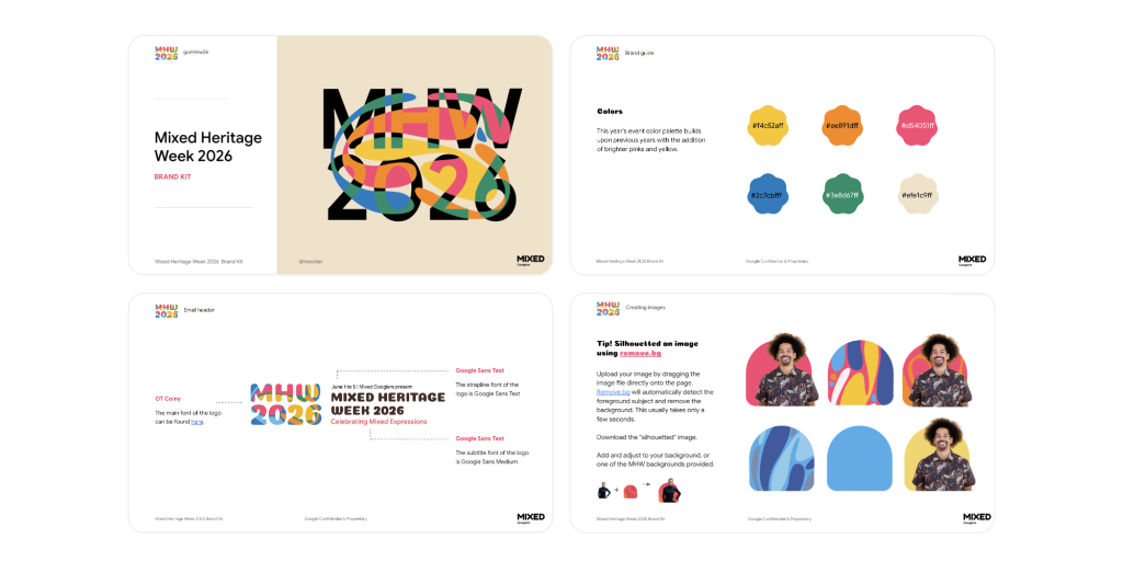
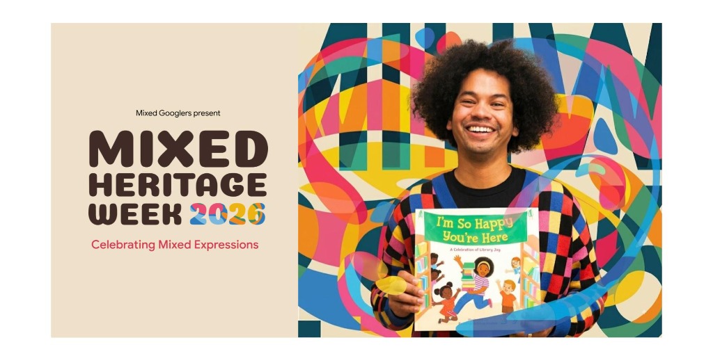
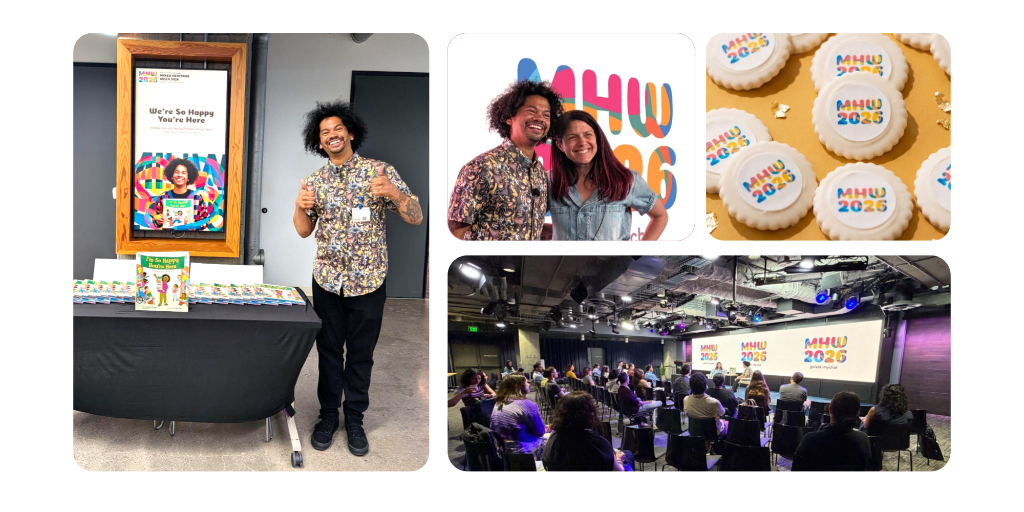
A visual identity for Mixed Heritage Week at Google
As Head of Brand & Design for the group, I created the visual identity and brand system for Mixed Heritage Week, then carried it across event graphics, presentations, web, promotional materials, and communications. The goal was to make the week feel cohesive, welcoming, and match the vibrant personality of our guest speaker.
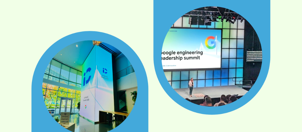
Events and experiences for senior technical leaders
Led visual design for a series of internal engineering forums and summits for four years, working with speakers to shape their stories and creating the event identity, presentations, websites, and environmental graphics for the company's most senior engineers.
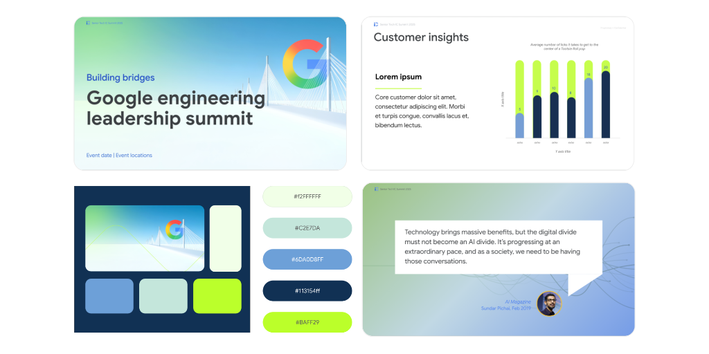
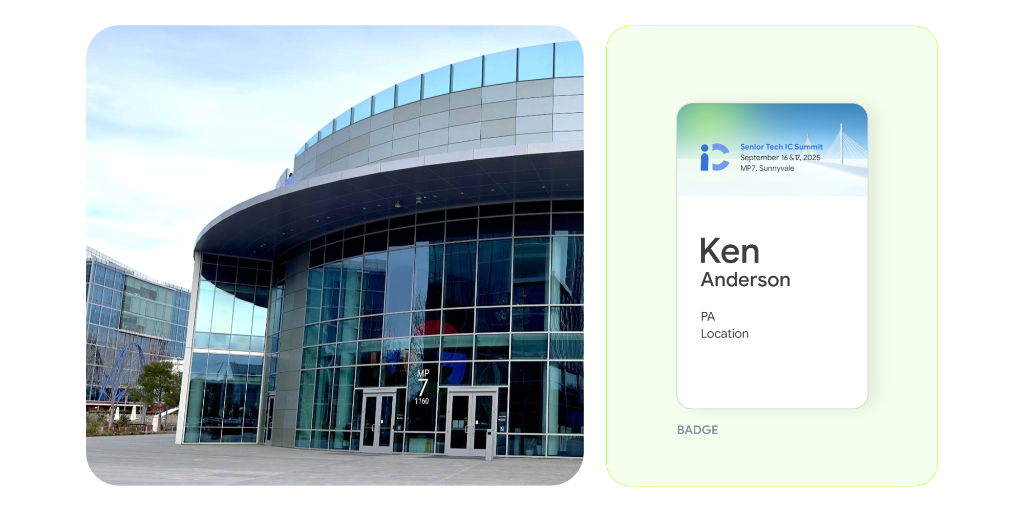
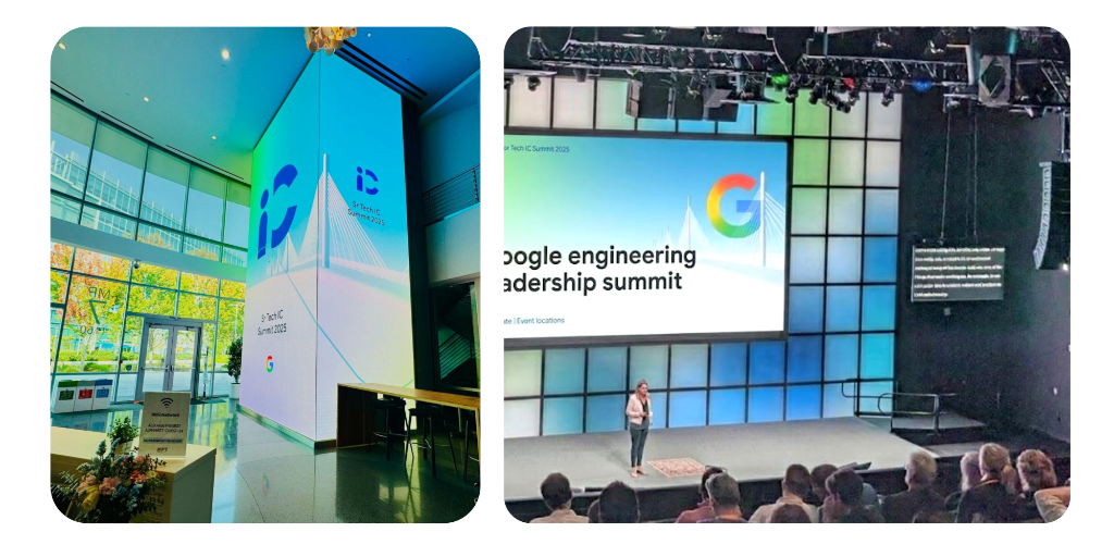
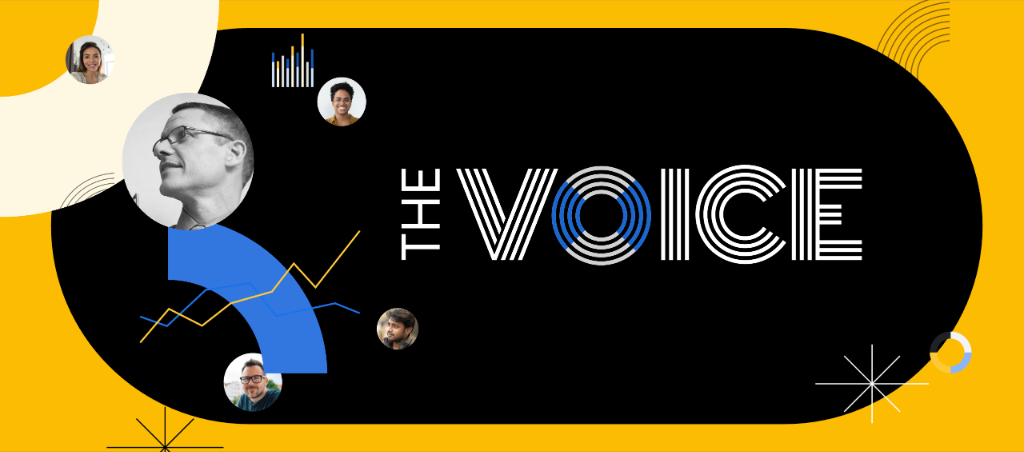
Turning customer feedback into a clear, human event experience
Created the visual identity, signage, and spatial design for an internal event focused on consumer insights. The design helped turn research and user feedback into something people could absorb and connect with across presentations and the physical environment.
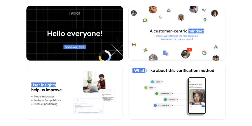
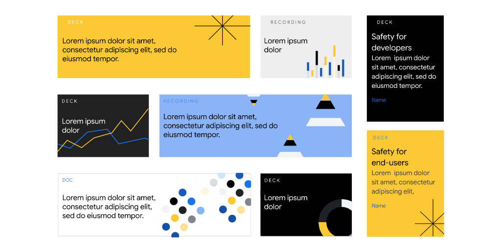
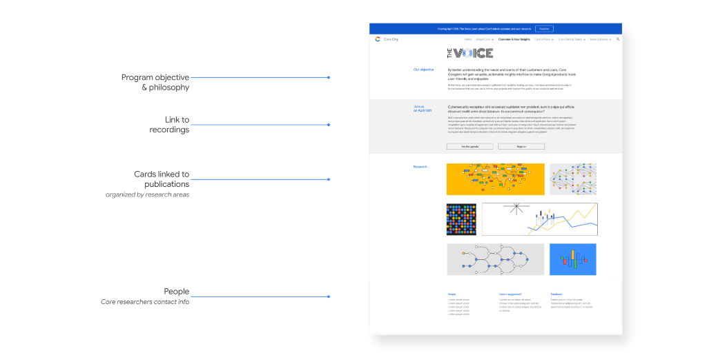
I like thinking about how a place can visually communicate ideas using brand colors, posters and signage.
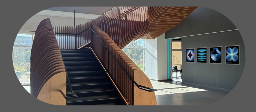
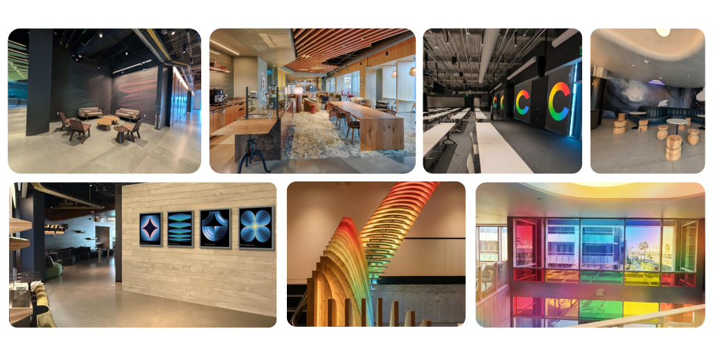
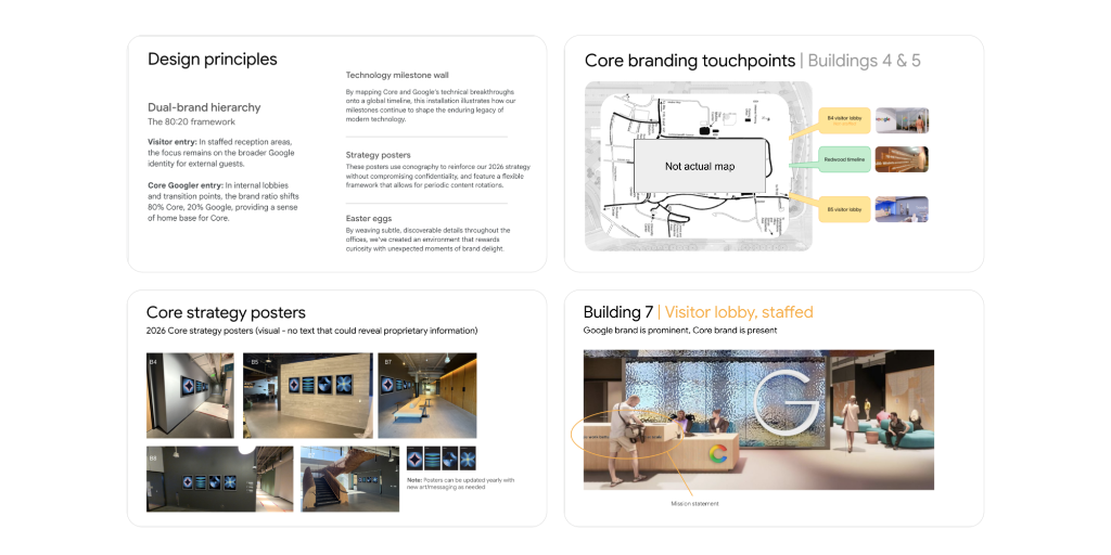
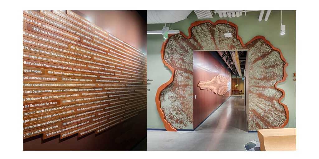
Helping bring our identity into a new Google campus
Worked with internal and external architects, internal teams, and teammates across four buildings on environmental graphics, interactive installations, and a technology timeline featuring 110 engineering milestones. The small details mattered too, helping the space feel connected to the people who work there.
I design physical things, like kits, stickers, and installations, that bring some energy and playfulness to workplaces and events.
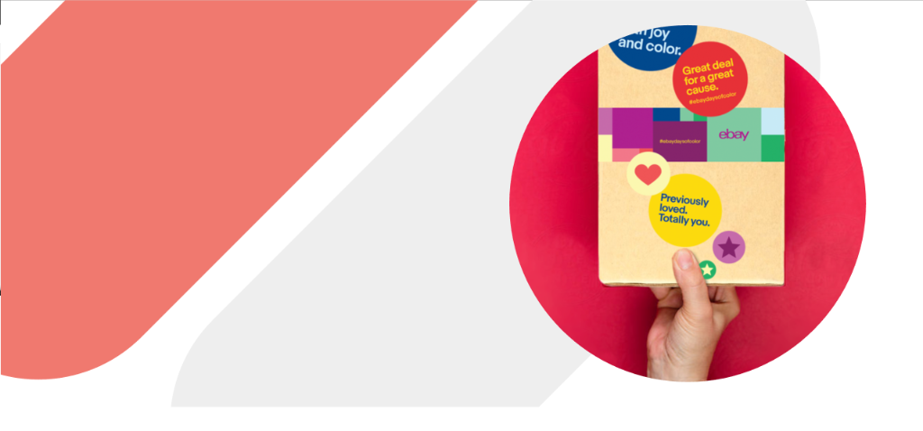
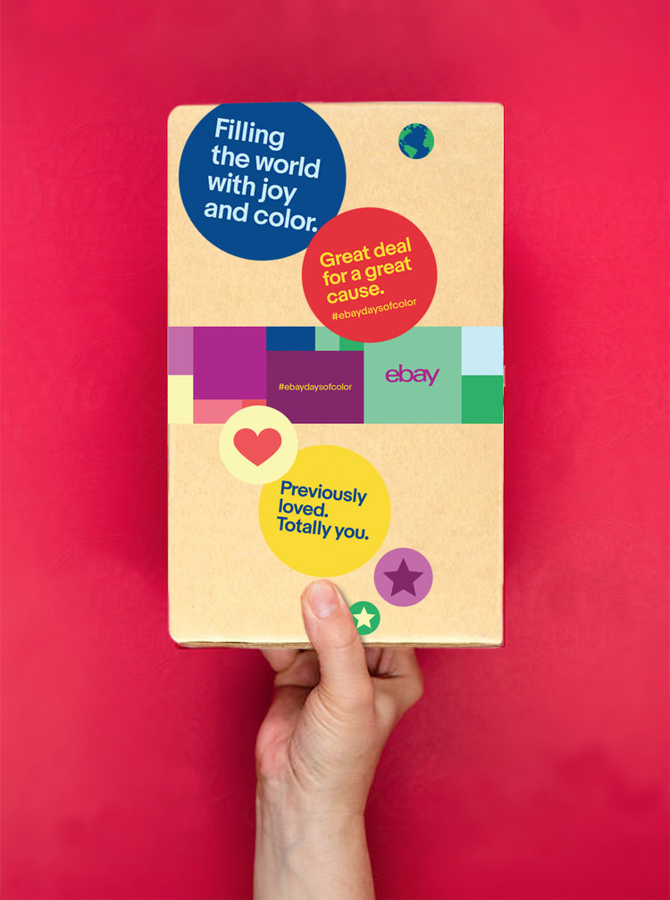
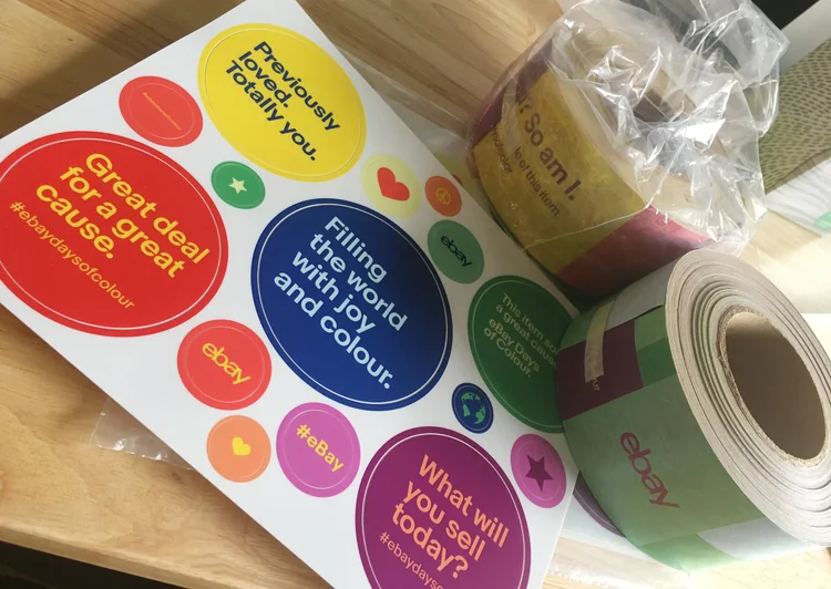
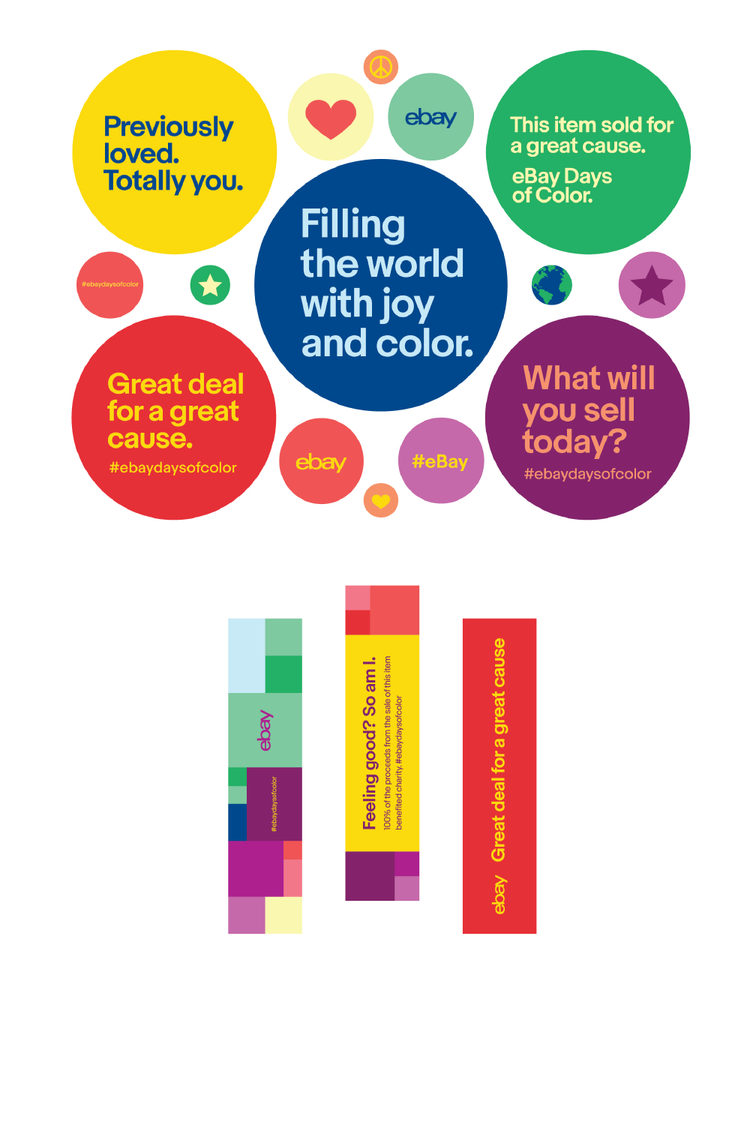
Illustrated stickers and packaging for eBay sellers
Created a fun, tactile onboarding experience for eBay sellers. Designed a custom illustrated box containing branded welcome stickers, seller badges, and onboarding booklets to celebrate seller milestones and drive platform engagement.
First I figure out what people need to know and why it matters to them. Then I try to let the visuals evolve from that.
Before I design anything, I want to know who it’s for. What do they care about? What do they already know? Speakers often bring slides pulled from presentations meant for other audiences, or focus on their team’s accomplishments instead of what the audience came to hear. I try to help them see their story through their audience’s eyes.
People are busy, and most of us scan before we read. I try to make the relevant thing visually obvious and clear away everything that gets in the way. People can read or listen, but rarely both at once, so slides should support the speaker, and not compete with them. Clarity almost always beats cleverness, and it beats polish too.
I always need to know the two or three ideas the audience must walk away with. The slick design or gorgeous venue isn’t the point. What matters is what happens afterward: someone understands the strategy, feels confident retelling the story, has a productive conversation, feels motivated to act, or remembers exactly the right things.
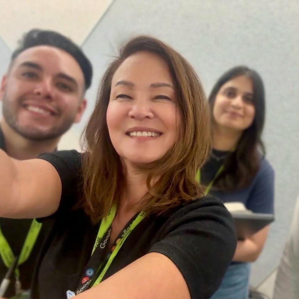
I’m Lisa Meckler, a designer and writer, currently working at Google. I was a designer at Wired, one of its first 20 employees, and I’ve always been curious about how technology can be visually represented. I’ve worked with senior leaders and engineering teams at Meta, New Relic, and Bay Area ad agencies. I like complicated projects, figuring out what the real story is, and making things clear without taking all the personality out of them.
I live in Berkeley, CA, and I’ve been busy making things for as long as I can remember. That instinct follows me outside of work too: I draw, write, and cook. I also volunteer in hospice and have coached a few seasons of girls softball. I enjoy movies with my kids, and walking our little dog Captain Sparkles in his little sweater. My favorite thing in the world is probably dogs dressed up like little people.
Say hello